
Color Combos for Cardmaking Video #1
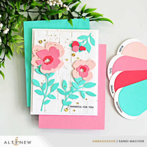
We’re starting the series with a soft, elegant palette featuring Blush, Tutu, Dahlia and Waterfall cardstock from Spellbinders. These warm florals paired with a cool blue create a beautiful balance of harmony and contrast.
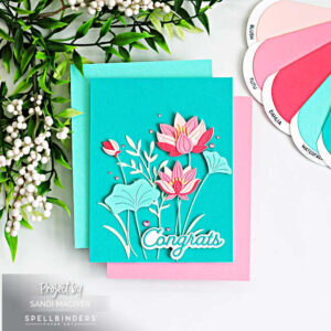
For Card #2 I used the same color combination but switched to a Teal Topaz card base–instantly shifting the overall fee from warm to cool and giving the design a fresh, completely different look.
Color Combos for Cardmaking Video #2
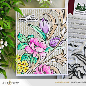
This Color Combo is a mix of fresh spring brights balanced by warm neutral flourishes and a textured fog background. The pinks and lavenders bring a soft feminine touch, while the aqua greens add freshness and energy to the design. Adding the warm neutral details help ground the brighter colors and give the card an elegant finished look.